How can graphic design be something more than just communication and something that looks beautiful? How can graphic design add a surplus value?
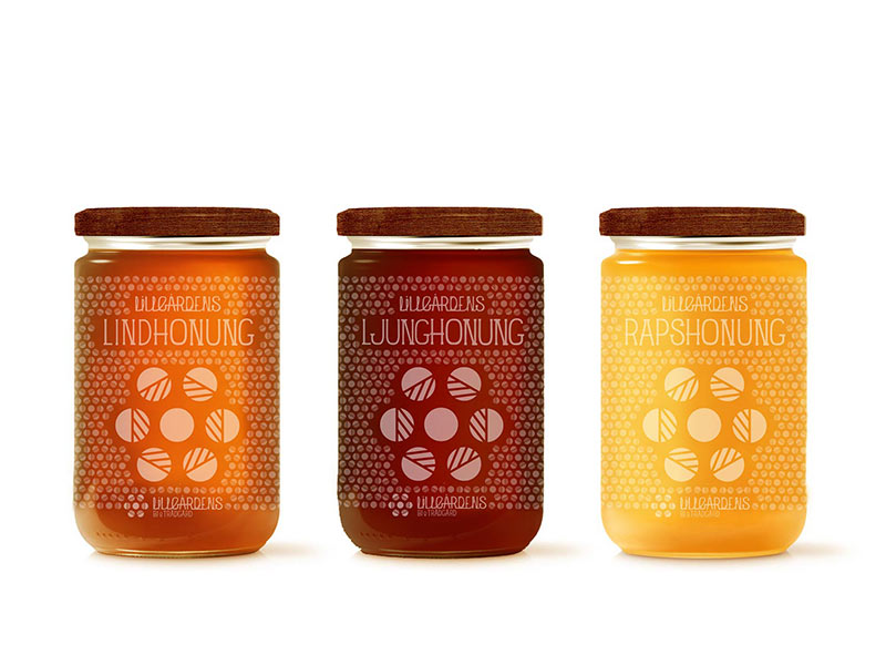
I worked together with Anna Hansson and her start-up bee keeping company, trying to tell her story and trying to highlight how important bees are on our planet.
Anna is now running the business and the products, with the graphical identity that we developed, are now for sale.
The icon is a combination of a honeycomb and the flowers from where the bee gets the nectar.
Putting together many icons creates a significant pattern, which gives characteristics to the brand identity and distinguishes it from other brands in the same field.
The typeface is inspired by craftsmanship and gives a vibe of the early 20’s century. The icon together with the handwritten typography creates the logotype.
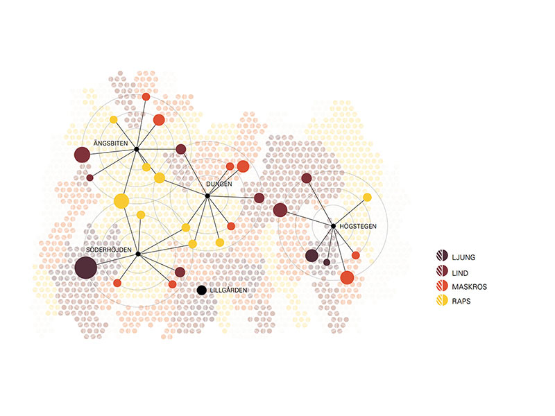
Trying to give the consumer a transparent history of the product, I created a map that visualizes the movement patterns of the bees. The map tells where the bees gets the nectar and shows what flower it comes from.